![Seeing Your True Colors]()
by lweber | Aug 12, 2015 | Print Buying Tips
 When it comes to colors and images, what we see on our computer screens and what gets printed can vary drastically. Here at Minuteman Press, we take important steps to provide the highest level of accuracy when printing your job on our digital printing presses.
Every morning, we calibrate our presses to ensure an exact recreation of our customers’ files. “Color calibrating” means putting the press through a series of tests and test prints. Yawn…we know that this doesn’t seem like an exciting way to start the day, but this step is important! These tests ensure that the color profile used for printing is the highest quality, and they prevent any color variations during a job.
During the calibration, a tool called a spectrophotometer is used to precisely match a standard set of pre-printed colors to the colors that the press produces. We place the spectrophotometer over a color sample. It uses a light and a diffraction gradient to separate a color into narrow wavelengths which then get measured and recorded by the press. It’s the same tool a home store uses to match paint. The press analyzes these recordings and then adjusts its settings to match. When you think about it, this is really advanced technology!
Regular color calibration is an important step in the professional printing process. Using advanced equipment and the right tools, like our spectrophotometer, means that Minuteman Press will give you high-quality printing and accurate colors. We are committed to helping your company look good.
If you have questions about printing, color, or image quality, please contact us any time. We love to educate our customers, and we know that teaching you and working together will result in the best quality printing for your business!
![Seeing Your True Colors]()
by lweber | Jul 14, 2015 | Print Buying Tips

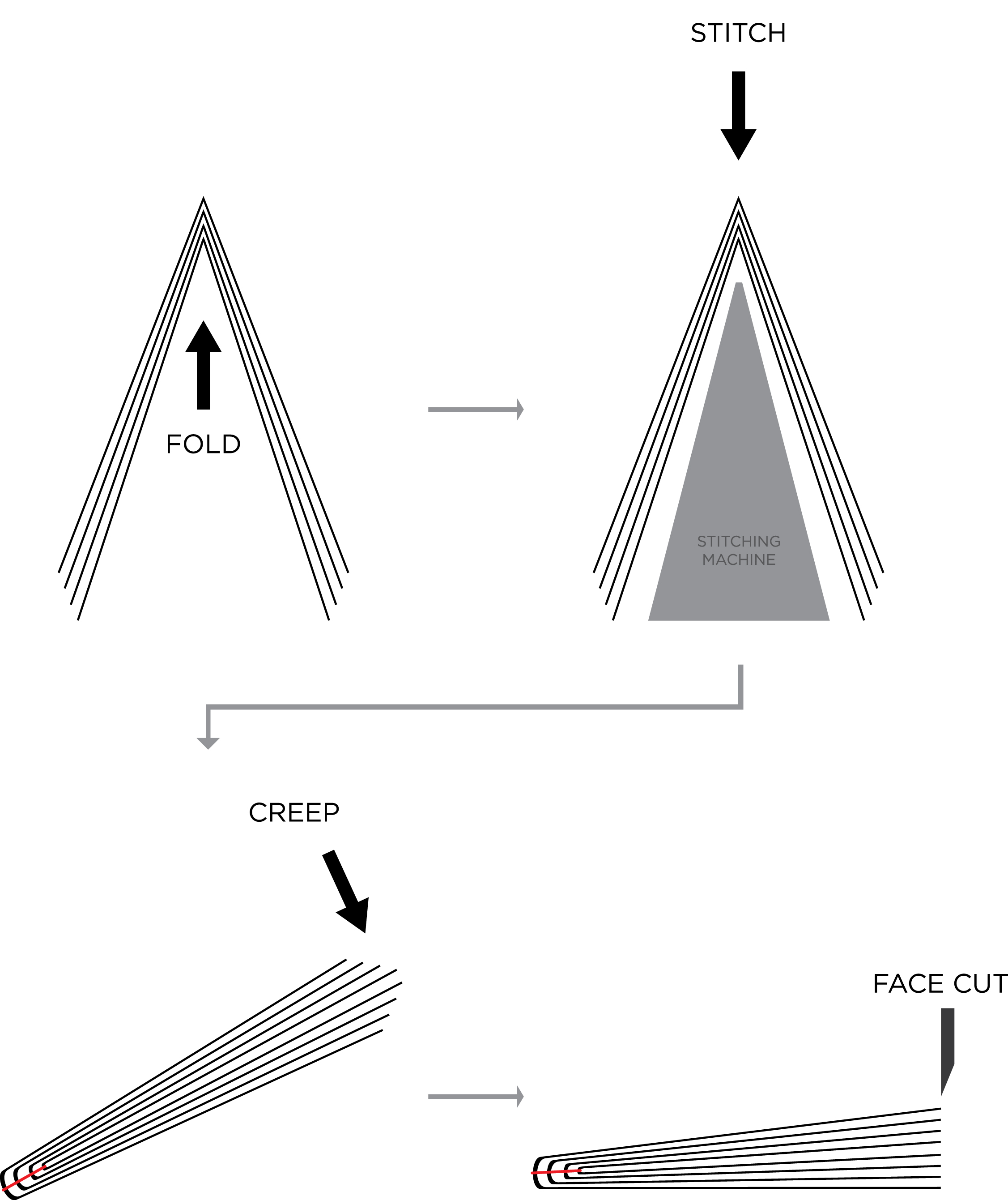
Take a look at any booklet, magazine, or catalog and you may notice what appear to be a few staples holding it together. These are not staples, however, but a saddle-stitched binding. Because most print jobs are large quantity, using regular staples to bind a booklet would take too much time. Therefore, a stitching machine is used. Instead of single staples, a stitching machine uses a long spool of metal wire which gets pushed through an awaiting booklet and then cut and folded to resemble a staple. Imagine a sewing machine with super strength. Here at Minuteman Press, we have multiple stitching machines including standalone units and all-in-one booklet makers that stitch, fold, and cut within seconds.
When folding the booklet in half, the pages on the inside will “creep”, or be pushed farther outward than the pages on the outside of the booklet. To account for this, the booklet is given a face trim to even out the edge. This will give the book a clean appearance. However, we need to be careful with this step. If the booklet is thick, the face trim can significantly reduce the margins of the inside pages. This dilemma can be avoided in the design process. The graphic designer should give the pages a “creep allowance”. This term sounds funny, but it means adjusting the inner and outer margins to allow a face trim with no consequences. The diagram below shows the way a booklet is folded, stitched, and cut properly.
At Minuteman Press, we print booklets in the form of school handbooks, playbills, directories, and owner manuals. We can help you create a new design, or we can work with your digital files. If you have a question about creating a booklet, please contact us any time.
![Seeing Your True Colors]()
by lweber | Jun 2, 2015 | Print Buying Tips
If you order printing, you may have heard the terms PMS and CMYK tossed around when talking about colors. We wrote a blog post back in October that summarized the differences between PMS spot colors and CMYK colors in clear terms. In case you missed it, click here.

When you understand the difference between PMS colors and CMYK, you can use this information to order cost-effective printed materials.
Start from the beginning…your company logo, business cards, envelopes, and a sales brochure. These are the items most businesses order. Your business cards and envelopes will likely be printed with PMS spot colors on a traditional printing press. Chances are, your sales brochure has lots of colorful photos and eye-catching colors. If you are ordering less than 10,000 pieces, we can assume that your brochure will be printed on a full-color digital press using CMYK. These printing methods are the most cost-effective for these particular jobs.
So…now you have some marketing materials printed with PMS spot colors and other materials printed with CMYK. Remember that nice logo you created for your business? How do we ensure that the colors look the same on your envelope (PMS spot color) and your brochure (CMYK)? These printing processes use completely different technology, and there are variances between machines, so you may end up with different shades of your true colors. Let’s work together to minimize this possibility!
Some PMS spot colors are difficult to match with the CMYK process. In CMYK, the colors cyan, magenta, yellow, and black, are layered to make the range of colors. Sometimes PMS and CMYK colors appear identical. In other cases, the color is different enough to be noticeable…and look unprofessional. Our years of printing experience and our Pantone color resources help us select colors that work every time. Having a conversation about color early in the design process will help you avoid years of struggling to make your materials look cohesive.
This image is from a book called the Pantone Color Bridge. It shows you what a PMS color will look like if you create it using CMYK. As you can see here, the difference can be noticeable. And this is the closest possible match!

If you are starting a new business, re-branding, or looking to create new printed materials, please ask for help! We love to educate our customers, and we are happy to guide you toward colors that will save you money and keep your company image consistent. We will help you maximize your budget and love the results.
![Seeing Your True Colors]()
by lweber | Mar 2, 2015 | Print Buying Tips
Why should I convert my files to PDF? Why can’t I just send you my Photoshop document? Have you ever asked yourself these questions? Have you ever wondered why we ask you to send a PDF? Here is the simple answer: PDF’s are the only way to ensure that your file looks exactly the same when we open it on our end.
PDFS are the only files that save metadata. Metadata is data about data. An image in your design contains metadata about its size, the color settings, the resolution, and much more. When you create text, a PDF will save metadata about positioning of the text and fonts you used. As a designer, you want to make sure that this metadata travels with your file so that we can print exactly what you designed.
Fonts are one of the most important reasons for saving your file as a PDF. There are hundreds of thousands of fonts across the Internet waiting to be found by designers. Just because you found the most perfect font for your design doesn’t mean that we have the same font. When we open your file on our computers, we may get a message stating, “We could not find the font [insert name]. Would you like to replace it?” This problem can be solved easily by exporting your file as a PDF. All the metadata, including that associated with your font, will be saved so you and the Minuteman Press staff don’t have to worry about editing your file again. Your design looks great, so why risk altering it? See what a difference a font change can make? PDFs are also useful because you may have designed your file in a different program than we use at Minuteman Press. It’s also possible that we have a your program but are using a different version. Even a slight update in the application could mean that we see your design differently on our computers than you do on yours. Use a PDF to preserve your hard work and ensure that your finished product looks like you envisioned.
You might be asking yourself, “So how do I save my file as PDF?” Here is a step-by-step guide to for some popular applications.
Microsoft Word & Publisher
File → Save As → under “save as type” choose PDF → Save
Adobe Photoshop:
To save as a PDF, your design must be created using CMYK color or spot color and must be flattened.
File → Save As → under “save as type” choose Photoshop PDF→ Save
In the window that opens next:
Choose the Adobe PDF Preset – [High Quality Print] → Save PDF
Adobe Illustrator
File → Save As → under “save as type” choose Adobe PDF (*.PDF) → Click Save
In the window that opens next:
Choose the Adobe PDF Preset – [High Quality Print] → Save PDF
Adobe InDesign
File → Adobe PDF Presets → High Quality Print → Choose a file name and Save
In the window that opens next:
Apply any options if necessary and click Export
We are happy to talk you through this process before you submit your file. It’s always easier to make changes before the job is printed! Just give us a call for help…888.937.4470.
Contact us any time. We love educating our customers and we’re here to help. If you have a printing question that you’d like us to cover in our blog, let us know!
![Seeing Your True Colors]()
by lweber | Jan 28, 2015 | Print Buying Tips
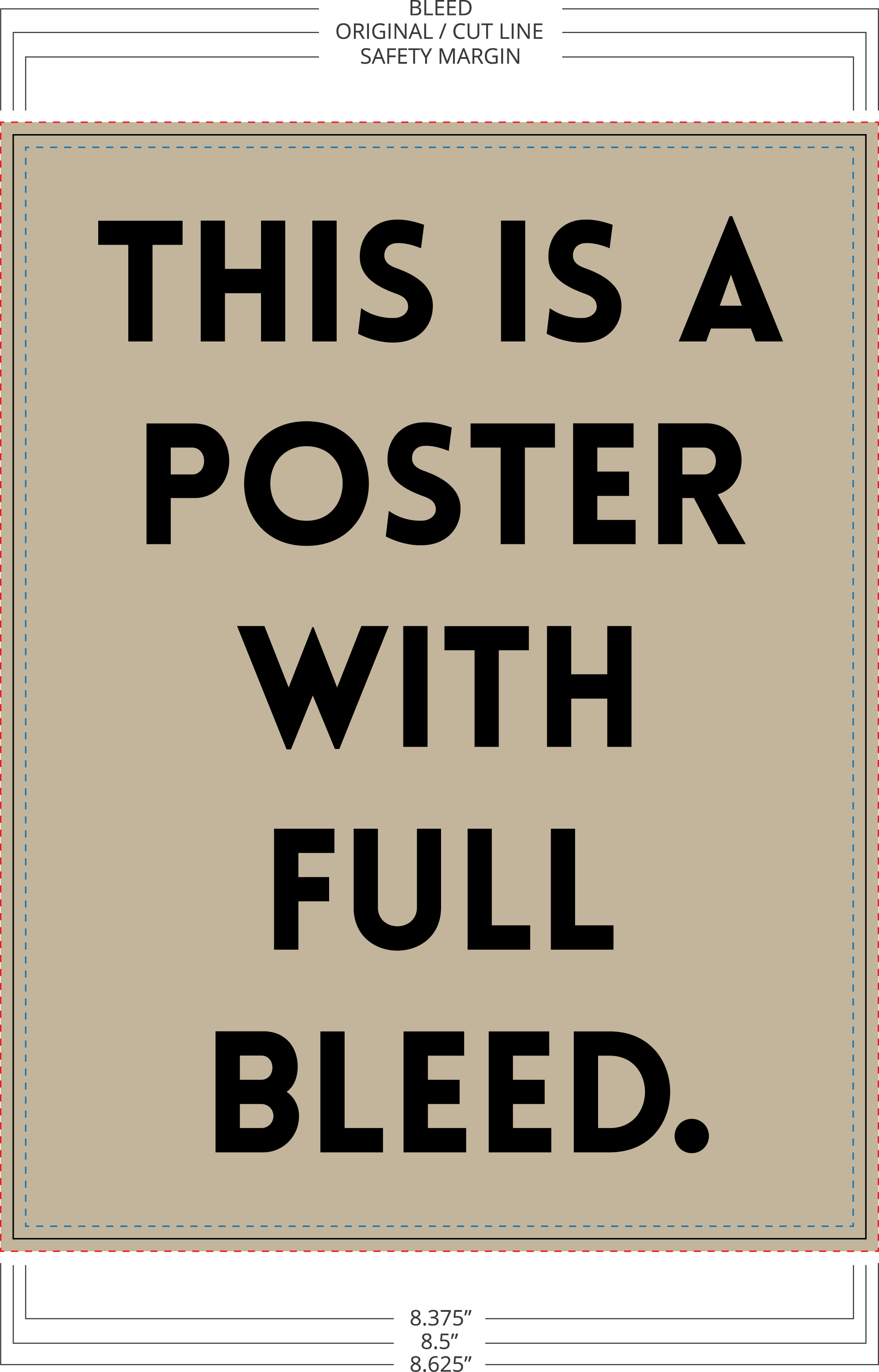
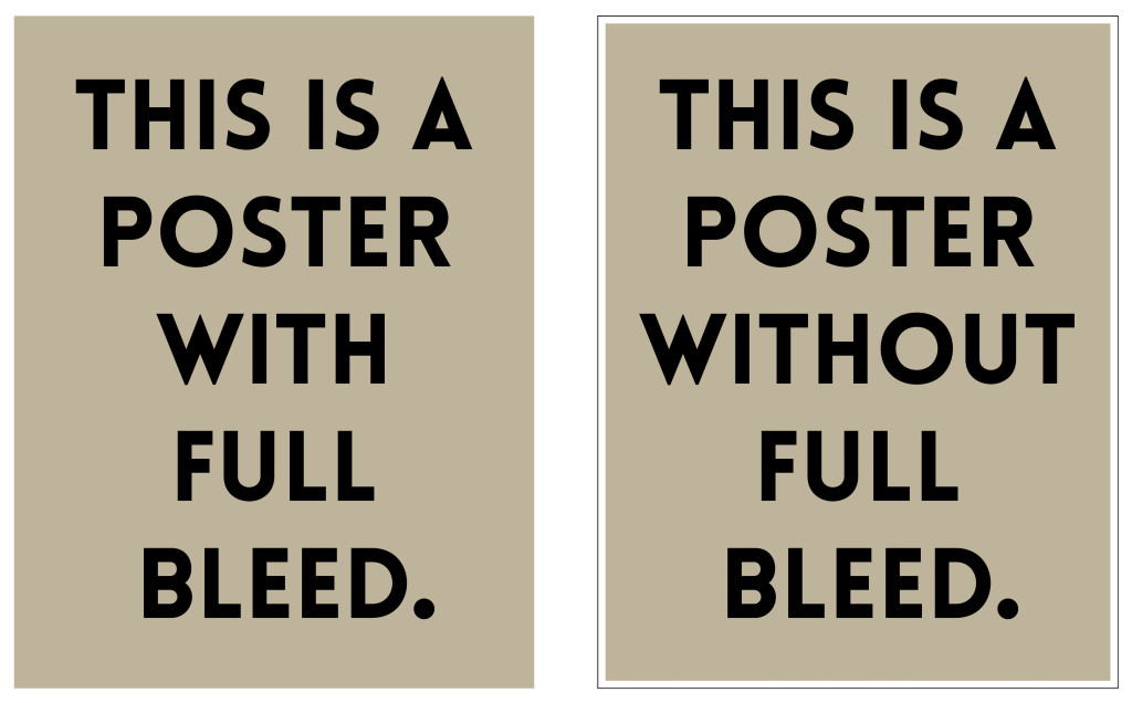
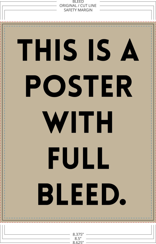
Are you trying to create a design that covers the entire page with no white border? This technique is called a “full bleed”. The following information will help you set up a file that bleeds properly. If you send in print-ready artwork, we don’t need to edit your files…your costs stay down, and we can print quickly to meet your deadlines!
Unless a file is set up to bleed, the finished piece will have a white border. Both offset and digital printing presses need to grip the edge of the paper to pull it through the press. You might hear the term “gripper margin” to refer to the edges of the paper. The press can’t print on the part of the paper that it’s gripping. To achieve bleed, we use a larger paper size, giving the press something to hold on to. After printing, we trim off this border and a sliver of the printed color, creating a clean bleed and the correct finished size.
What to do
Let’s say you were designing an 8.5” x 11” poster and you wanted a photograph to serve as the background, covering the entire image (full bleed). As you are setting up your document you should create bleed marks that extended 1/8” (0.125”) outside all edges so that the size of the document including bleed marks is now 8 3/4” x 11 1/4”. Most programs will allow you to do this while setting up your document, but you can also do it manually with construction marks if necessary. Now that you have a blank document with bleed marks, you can begin designing. Imagine that the bleed marks you’ve just created are the new borders of your document. Any image that you would like to fill the entire piece of paper should be placed so that it extends past the original dimensions to all the bleed marks. Remember, we will trim the finished piece to the correct size.
What not to do
Please do not take your final design and simply scale it larger to fit a document with bleed marks. Although it may work for some designs, simply scaling the design will also scale all the text and content. Font size will change and picture quality will diminish. The end result will be a design that appears to be zoomed in. The correct way to design for full bleed is to understand how it works and design with that intention from the start. Only the content that you want displayed edge to edge on the final product should be sized so that it fills to the bleed marks.
Safety Margins
Next, you need to account for safety margins. Safety margins are the exact opposite of bleed marks. They are a margin set 1/8” inside the original dimension (bleed is set 1/8” outside) where no critical text, image, or content should be placed. Because of slight mechanical tolerances, your document might be trimmed anywhere in the margin area. Do not place any critical information such as page numbers or headers and footers inside this margin.
Overview
If you follow these recommendations for creating bleed, your finished product will look like the design you envisioned. Taking the time to understand and create bleed is worth the effort because your finished piece will have a more professional, eye-catching look.
In short:
Bleed – extend borders 1/8” outside original dimensions
Safety Margins – no critical content within an 1/8” (.125″) of original dimensions
We are happy to work files created by you or your outside designer. If you have any questions along the way, please don’t hesitate to contact us! Our goal is to educate our customers and create lasting relationships.
![Seeing Your True Colors]()
by lweber | Oct 27, 2014 | Print Buying Tips
When printing a job on an offset press, two color systems can be used: Spot color and CMYK.
 In spot color printing, you select a colored ink for the job at hand. We call these unique colors by their PMS number. PMS stands for Pantone Matching System, and it is the standard by which all print providers refer to ink colors. Spot color is commonly used for business logos, business cards, and letterheads where one to three solid colors are used. Spot colors cannot be used to print photographs or multicolored images. The design must use solid colors because the printing press will be filled with the each unique ink chosen for the job. Each spot color is mixed using a palette of 14 basic colors; resulting in smooth, bright, and consistent hues. The Pantone system provides a formula to create each spot color. By using this exact formula, printers can recreate your spot colors the next time you order. The image to the left shows an open PMS book with its range of colors.
 When printing a color photograph or a range of colors, we use the CMYK color system. CMYK, also known as ‘process color’ or ‘four color’, refers to using only the colors cyan (C), magenta (M), yellow (Y), and black (K) in layers of tiny dots to produce the desired colors in the design. The combination of CMYK can produce almost any color imaginable. In this process the content in your design is broken down into these four colors. As your paper travels through the press, each color is printed in a layer of dots in a specific order. After all four colors have been layered on, your full color image appears. The image to the left shows how layers of cyan, magenta, yellow, and black create a full-color photograph.
Files designed with PMS spot colors can be converted to CMYK. This change would be necessary if you decide to use digital instead of offset printing. Digital printing presses use CMYK as their sole color system. If you see a file designed with RBG (Red, Blue Green), it has been designed for viewing digitally and not printing. RGB is the color system used on computer monitors. These files need to be converted to CMYK before being printed.
We can help you determine the best color system to use for your printing job. We are always happy to educate our customers about printing! Our graphic designer can work with you to plan your project, or we can work with your outside designer. Please contact us with any questions.
Photos from Pantone.com and Pantone.co.uk